When it comes to optimizing a website for conversions, the hero section of your landing page plays a crucial role.
It’s the first thing visitors see, and it sets the tone for their entire user experience. In this micro-lesson, I’ll walk you through five essential strategies for improving the hero section of your website, with a specific focus on SaaS companies.
These actionable insights will help you boost your conversion rate, engage users, and drive more sales.
You can skip the blog and just watch the video.
Clear and Compelling Messaging
Your hero section is all about making a first impression. For SaaS companies, this means clearly communicating the value of your product or service in as few words as possible. The messaging should immediately answer a visitor’s most pressing question: “What’s in it for me?”
Why Messaging Matters for Conversion Rate
Clarity in your messaging is vital because visitors decide within seconds whether they’ll stay or leave. The key is to present a value proposition that speaks directly to your target audience. For example, instead of saying, “We offer the best software solutions,” try something more specific like, “Save 50% of your time managing projects with our intuitive software.”
Additionally, strong messaging sets up expectations for what follows, including the call to action (CTA). Consistency in tone, style, and wording throughout your landing page reassures visitors, increasing the likelihood of conversions.
Best Practices for Messaging:
- Keep it concise: Use short, clear sentences that focus on value.
- Focus on benefits: Highlight what the user will gain, not just features.
- Use bold, eye-catching fonts: Ensure that your headline stands out visually.
- Be specific: Avoid vague statements—get straight to the point.
By refining your hero section’s messaging, you establish an immediate connection with the user, setting the stage for higher engagement and improved conversion rates.
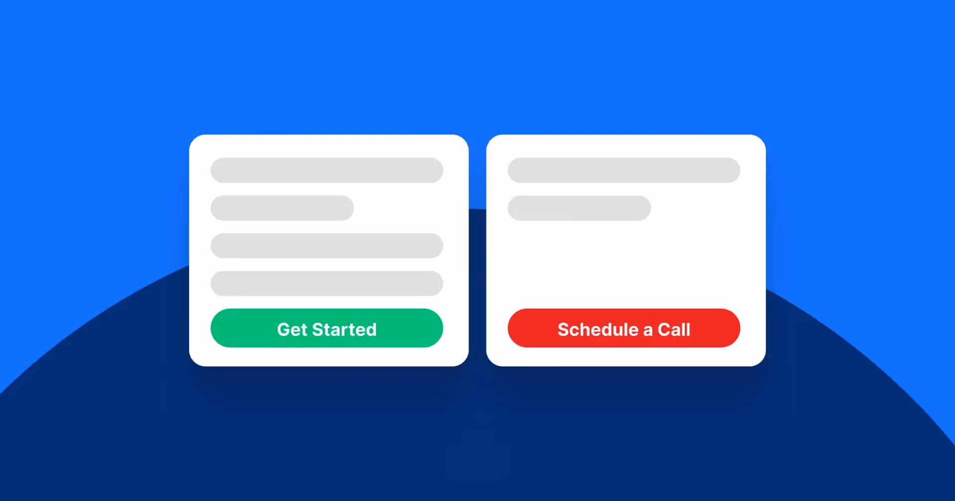
Crafting an Irresistible Call to Action (CTA)
Your call to action is the conversion point where users either click or move on. A CTA needs to be clear, prominent, and actionable to drive engagement. The design, placement, and wording of your CTA can make or break your conversion rate.
How to Optimize Your CTA:
- Consistency is key: Your CTA needs to match the intent of your messaging. If the message is about saving time, your CTA should reinforce that benefit, e.g., “Get Started in Minutes.”
- Position it front and center: Ensure your CTA is above the fold and visually distinct. You want visitors to take action without scrolling down.
- Make it actionable: Use verbs that encourage action. Instead of “Submit,” use phrases like “Start Free Trial,” “Get Started,” or “Explore Features.”
- Use contrasting colors: A well-designed button that contrasts with the rest of your page draws attention, increasing the likelihood of a click.
A well-crafted CTA invites users to take the next step confidently, which is vital in improving conversion rates.
Leverage Social Proof to Build Trust
Social proof—whether it’s testimonials, client logos, or user reviews—can be the deciding factor in a user’s decision to convert. When visitors see that others have benefited from your service, they are more likely to trust your brand and take action.
Why Social Proof is Crucial for SaaS Websites
SaaS products are often a significant investment for companies, so trust is critical. When potential clients see that industry leaders or recognizable companies are using your service, it builds confidence.
Examples of Social Proof in Action:
- Client logos: Showcasing logos of well-known clients right in your hero section establishes credibility.
- Customer testimonials: Real customer quotes can humanize your brand, providing reassurance to new visitors.
- Third-party reviews and ratings: Displaying reviews from trusted sources (like G2, Trustpilot, or Capterra) offers additional validation.
Social proof enhances user experience (UX) by giving visitors the assurance they need to move forward with a purchase or sign-up.
Design with the User in Mind
A well-optimized user experience (UX) doesn’t just look good—it functions intuitively. Design should guide the user’s eye to the most important elements, such as the headline, social proof, and CTA. A cluttered or confusing layout distracts visitors, leading to higher bounce rates.
Design Strategies for High Conversions:
- Simplicity: Avoid overwhelming users with too many elements. A clean, minimalistic design with a strong focus on the CTA and key messaging increases conversions.
- Visual hierarchy: Use size, contrast, and spacing to direct attention to important elements. The headline should be the largest, followed by supporting text, and then the CTA.
- Consistent branding: Use your brand’s color palette, fonts, and style to create a cohesive experience that reinforces trust.
- Fast loading time: Slow websites frustrate users and hurt your SEO rankings. Ensure your hero section loads quickly to keep visitors engaged.
Optimizing the hero section’s design for ease of use not only improves the user experience but also significantly boosts your conversion rate.
Remove Distractions and Focus on One Goal
One of the most common mistakes in landing page design is overcrowding the page with too many CTAs, images, or offers. By removing unnecessary distractions, you guide users toward one clear goal—whether that’s signing up for a free trial, scheduling a demo, or subscribing to a newsletter.
How to Eliminate Distractions:
- Remove excess navigation: Limit the number of links or buttons to minimize the chances of users straying from your desired action.
- One CTA per page: Focus on a single, powerful call to action that aligns with the page’s overall goal.
- Use whitespace effectively: White space helps guide the user’s focus to what matters most. It makes your design look clean and encourages visitors to engage with the key elements.
By simplifying the layout and focusing on one main goal, you make it easier for users to follow through on your call to action, which in turn increases your conversion rates.
Final Thoughts: Testing and Optimization
Improving your website’s conversion rate is not a one-time effort. Regular A/B testing is essential to find what works best for your audience. Test different headlines, CTA placements, and design variations to determine which combination delivers the highest conversions.
What to Test:
- Headline wording and placement
- CTA button color, text, and position
- The effectiveness of social proof (e.g., logos vs. testimonials)
- Overall layout and design elements
A consistent focus on website optimization ensures that your landing pages continue to perform at their highest potential, driving sales and improving the overall user experience.
Your website’s hero section is a vital element in improving conversion rates. By focusing on clear messaging, a strong CTA, relevant social proof, and simplified design, you can significantly enhance user engagement and conversions. For SaaS companies, in particular, these strategies can mean the difference between a visitor bouncing and a visitor becoming a long-term customer.
If you want to drive higher conversion rates and optimize your landing page effectively, start by analyzing and refining your hero section. Whether yo